—Elizabeth Ellcessor
In early August 2016, Apple released a beta version of iOS 10, the new iPhone operating system expected to be widely available in September. In this beta, there were a host of new emoji (icons that can be incorporated into digital text to convey words, ideas, or emotions). Going well beyond the classics—smiley faces, poop, and national flags—the over 100 new and revamped emoji include more racially diverse options, more gender diversity and career-oriented representations of women, and changes to the overall look of many existing emoji.[i]
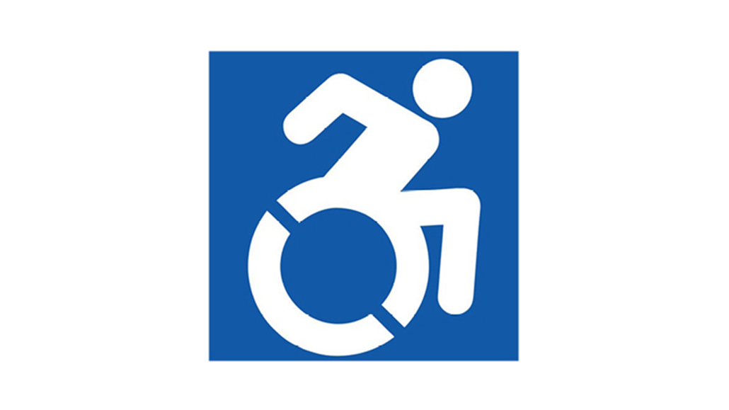
One of the new emoji is a revamped accessibility symbol. The “Wheelchair Symbol,” or International Symbol of Access, was approved as a Unicode emoji in 2005 and is grouped with other signage; gendered restroom signs, customs and automated teller icons, and other signs one might see in public spaces. The familiar wheelchair symbol—a stick figure sitting up in a semicircular rendition of a wheelchair, usually drawn in blue or in white on a blue field—is understood to indicate bathrooms, entrances, and other spaces that are accessible to wheelchair users. Versions of this symbol are also used to indicate priority parking spaces automated doors, and other physical features that increase accessibility for people with mobility impairments. The symbol has also been taken up in digital contexts to indicate other forms of accessibility for people with disabilities, making it function as a symbol for “access” beyond literal wheelchairs.
The emoji introduced in iOS 10, however, is not the familiar static wheelchair symbol. Instead, the new representation shows the stick figure user in motion, arms bent, body angled forward. It is nearly identical to the icon developed by the Accessible Icon Project, led by Brian Glenney and Sara Hendren. Initially an act of “design activism,” the Accessible Icon Project began in 2011 in Boston, Massachusetts, using stickers and a graffiti aesthetic to edit existing signage and prompt conversations about disability and access.[ii] The accessibility icon was then brought into line with international standards, and released into the public domain. It was adopted for signage in New York City in 2013, by the state of Connecticut in 2016, and has been used by activists, artists, and institutions around the world. Apple follows Twitter and Facebook in using the Accessible Icon as its rendering of the Wheelchair Symbol emoji.[iii]
The inclusion of this revised accessibility symbol as an emoji demonstrates how art and activism may influence culture, industries, and policies with major implications for access and participation in broader society. It is a clear example of how “cultural accessibility,” as described in my book, Restricted Access, can chart new paths to access for people with disabilities. Cultural accessibility incorporates emotional and cultural access needs, as well as the technological or material structures needed for access. It is produced through collaboration, and “may be culturally relevant, actively inclusive of difference, and ultimately a co-created process that moves ever toward greater flexibility and lesser restriction.”[iv]
In Restricted Access, I advocate for studying access as an intersectional and variable phenomenon. What enables access for a young, able-bodied urbanite may not provide similar levels of access for elderly, disabled, or rural populations, for instance. Infrastructural differences, economic conditions, technological features and literacy, and the very capabilities of different bodies can result in very different conditions of access. To parse these factors, I suggest considering media access from the perspectives of regulation, form, content, use, and experience. These categories are as useful in interrogating material access to media technologies and content as they are in exploring the structures that support access (such as accessibility signage and policies). Below, I use them to explore the origins and potentialities of the Accessible Icon emoji, as it reaches millions of potential new users via iOS 10.
The story of the Accessible Icon emoji begins and ends with experience. The lived experiences of people with and without disabilities were integral to Hendren and Glenney’s work, which initially asked how one could edit a city to make it more accessible or inclusive. Furthermore, the initial graffiti-style deployment of stickers to change public signage relied upon the actions of volunteers and activists; the notoriety and impact of the Accessible Icon were originally found in how it disrupted public space and forced reconsiderations of access by challenging a pervasive symbol in everyday life. As Glenney told The Ringer, the icon “gained ground when the disenfranchised had control.”[v]
Both form and content are relevant to understanding the development and uptake of the Accessible Icon. Formally, the icon retains many features of the International Symbol of Access. The color scheme and basic idea of a person using a wheelchair are retained. This enables the Accessible Icon to benefit from the familiarity of the existing symbol, and eases its inclusion in official signage. Yet, the meaning (or content) conveyed is quite different. Hendren wrote that the “rectilinear geometry” of the International Symbol of Access “doesn’t show the organic body moving through space, like the rest of the standard isotype icons you see in public space.”[vi] In short, despite its utility in facilitating the movement and access of people with disabilities, this symbol displayed a static, less organic image that objectified rather than empowered. In contrast, Leah Serao of Disabled World writes that “By illuminating movement and motion, the [Accessible Icon] celebrates where individuals with disabilities have come from and where they are going next.”[vii]
The varied uses of the Accessible Icon are far reaching. While it was intended initially as public art, sparking reflection on existing infrastructures and ideas about disability, it has moved toward more official uses, such as signs, buttons, and digital icons. Additionally, since neither intended nor dominant uses are exclusive, the Accessible Icon continues to appear in activist and artistic contexts. The Museum of Modern Art (MoMA) accessioned the icon for its permanent collection. Mike Mort has used the icon as the basis for artistic renditions of black and disabled superheroes.[viii] Grassroots groups around the United States have painted over existing parking space icons, using a stencil to render the active version. Additionally, hospitals, kiosks, and many other institutions around the world have chosen to use the Accessible Icon. A framed version sits in my campus office, indicating both my research area and the provision of an accessible space for students.
The spread of the Accessible Icon happened in relation to several forms of regulation. As noted above, its use is now mandated in some places, a form of local legal regulation. However, the icon itself chose not to pursue the most obvious form of regulatory legitimation—the International Organization for Standardization (ISO). The ISO has committees that decide on the shapes, colors, and symbols for “public information symbols,” but the Accessible Icon Project did not submit to the ISO, perhaps because, as Glenney says, the organization “doesn’t really like our design.”[ix] Beyond such official bodies, however, industrial uptake by Apple and other corporations acts as a form of regulation. These actors spread iconography regardless of legal or international policies, allowing the growing ubiquity of the Accessible Icon to become normalized and, potentially, to change hegemonic ideas about disability.
 To return to experience, the inclusion of the Accessible Icon in the iOS 10 emoji library offers an opportunity for ongoing use, reworking, and discussion of the icon and the forms of access and disability that it might be used to represent. Users will have the opportunity to augment its meanings, to place it in proximity to other images and concepts, and to create new assemblages that represent disability and access differently. As Serao concludes, “the people keep moving this active symbol forward.”[x] And this is the heart of cultural accessibility—collaboration and participation in the interest of including marginalized perspectives, subjugated knowledges, and alternative means of living daily life.
Elizabeth Ellcessor is Assistant Professor of cinema and media studies at Indiana University—Bloomington.
[i] Dillet, Romain. “Apple Drops a New iOS 10 Beta with a Hundred New Emoji.” TechCrunch. August 1, 2016. https://techcrunch.com/2016/08/01/apple-drops-a-new-ios-10-beta-with-a-hundred-new-emoji/
[ii] Hendren, Sara. “An Icon is a Verb: About the Project.” The Accessible Icon Project. February 2016. Available at: http://accessibleicon.org/. Accessed 25 August, 2016.
[iii] Google, Samsung, Windows, and others still display the older, static version. See “Full Emoji List.” Unicode. Available at: http://unicode.org/emoji/charts/full-emoji-list.html#267f. Accessed 25 August, 2016.
[iv] Ellcessor, Elizabeth. Restricted Access: Media, Disability, and the Politics of Participation. New York University Press, 2016. p. 180
[v] Brooks, Jr., Carl. “How the Accessibility Emoji Got Its Start.” The Ringer. 13 August, 2016. Available at: https://theringer.com/accessibility-emoji-apple-ios-10-9816974b6ebf#.7git2tyh9. Accessed 25 August, 2016.
[vi] Hendren, Sara. “An Icon is a Verb: About the Project.” The Accessible Icon Project. February 2016. Available at: http://accessibleicon.org/. Accessed 25 August, 2016.
[vii] Serao, Leah. “The Story of the Accessible Icon Emoji: iOS 10 Update.” Disabled World. 18 August, 2016. Available at: http://www.disabled-world.com/disability/accessibility/ios-10.php. Accessed 25 August, 2016.
[viii] Mort, Mike. Twitter. Available at: https://twitter.com/MikeeMort/status/758434472480088064. Accessed 25 August, 2016.
[ix] Brooks, Jr., Carl. “How the Accessibility Emoji Got Its Start.” The Ringer. 13 August, 2016. Available at: https://theringer.com/accessibility-emoji-apple-ios-10-9816974b6ebf#.7git2tyh9. Accessed 25 August, 2016.
[x] Serao, Leah. “The Story of the Accessible Icon Emoji: iOS 10 Update.” Disabled World. 18 August, 2016. Available at: http://www.disabled-world.com/disability/accessibility/ios-10.php. Accessed 25 August, 2016.